Packaging that stands out on a shelf
Packaging stands out when it is found, understood and wanted in about three seconds — on a shelf and in a feed thumbnail. A package that is beautiful up close but unreadable at distance, or clear on a shelf but invisible in a thumbnail, will lose the sale in the place it was not designed for.
Key takeaways
- Packaging has three jobs in three seconds: be found, be understood, and be wanted — on a shelf and in a thumbnail.
- Hierarchy first: brand, then product and variant, then the one reason to choose it — everything else comes after.
- Stand out by breaking one category pattern deliberately, while keeping the rest familiar enough to be trusted.
- Test before printing: shelf photograph at thumbnail size, variant distinction, unboxing, and the whole range together.
The three-second test
A package has about three seconds, on a shelf, to do three jobs: be found, be understood, and be wanted. Found means the eye lands on it among dozens of competitors. Understood means the buyer knows what it is, what variant it is, and roughly what it costs to care about — without picking it up. Wanted means something in the design makes the buyer reach for it rather than the one next to it. Most packaging fails one of the three, and the failure is usually visible in a photograph of the shelf, not in a presentation of the design.
The test is easy to run and hard to pass. Photograph the package on a shelf with its real competitors, shrink the photograph to thumbnail size, and look at it from three metres away — or, more honestly, look at the thumbnail on a phone. If the brand cannot be found, the product cannot be understood, or nothing makes you reach for it, the design has not passed, however good it looks when you hold it in your hand. Design for the shelf and the feed at the same time, because most products now live in both, and a package that only works in one place loses the other sale.
Hierarchy: what reads first, second, third
Hierarchy is the order in which information is read, and it is decided before decoration, because a beautiful package that cannot be read is a failed package. First, the brand — or, for a new brand, the product itself, if the brand is not yet known. Second, the product and the variant: what it is, which flavour, which size, which version. Third, the claim or the reason to choose it: the one thing that makes this product different from the one next to it.
Everything else — certifications, ingredients, stories, legal text — comes after those three, and most of it should not compete with them. A package that tries to say everything on the front says nothing, because the eye has no order to follow. The discipline of packaging design is deciding what not to say on the front, and where the rest goes. That discipline is what makes a range look professional: every product in the range follows the same hierarchy, so the shelf reads as one brand, not as a collection of separate designs.
Colour, shape and the category pattern
Every category has a pattern: the colours, shapes and layouts that most products in it already use. Standing out does not mean breaking the pattern for its own sake — a package that breaks every pattern looks out of place, and buyers distrust what looks out of place. Standing out means breaking one pattern, deliberately, while keeping the rest familiar enough to be trusted.
That one break could be colour: the one warm colour in a category of cool ones, or the one matte finish in a category of gloss. It could be shape: a taller, narrower, or more tactile form. It could be type: a larger, simpler, or more distinctive wordmark. The choice depends on the category and on what the brand can own — a break that any competitor can copy in a month is not a position, it is a decoration. The best breaks are the ones tied to the product itself: a shape that fits how the product is used, a colour that comes from an ingredient, a material that reflects how the brand thinks about waste. Those are harder to copy, because they are not just design choices, they are product choices.
Unboxing: the first ten seconds after delivery
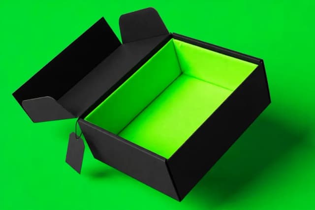
For a product sold online, the shelf test is replaced by a different test: the first ten seconds after the box arrives. The customer opens the box, and what they see first, second and third determines whether the product feels premium, thoughtful or careless — before they have used it at all. Unboxing is packaging design, even though it happens after the sale, because it determines whether the customer buys again, recommends the product, or posts about it.
Unboxing design is about order and reveal. What is on top when the box opens? Is it the product, a note, or packing material? Is the product protected in a way that feels considered, or in a way that feels like an afterthought? Is there a reason to keep the box, the insert or the card, or does everything go straight in the bin? Those details are cheap to design and expensive to ignore, because they are the only part of the product experience that every online customer shares, regardless of how they use the product itself.
A hypothetical example
Take a hypothetical food brand launching a new snack into a category full of bright, loud, cartoonish packaging. Its first design tried to out-shout the category — brighter colours, bigger type, more claims on the front — and it disappeared on the shelf, because it looked like everything else, only louder. The redesign did the opposite: one break, deliberately chosen. The category was loud, so the new package was calm: a matte finish, a restrained colour, a large, simple product name, and a single claim on the front. Everything else moved to the back.
On the shelf, the calm package was the one the eye landed on, because it broke the pattern without breaking trust. In a feed thumbnail, the large product name was the one that could still be read. In unboxing, the box opened to the product itself, not to packing material, with a single card that explained the product in one sentence. Nothing about the product had changed. The packaging had stopped trying to say everything, and started saying one thing clearly, in the place where the buyer actually decides.
What should you test before you print?
Test four things before printing: the shelf photograph at thumbnail size, whether variants can be told apart at a glance, the unboxing first ten seconds, and whether the whole range reads as one brand. Fix any failing test before printing, because printing is the expensive part.
Before printing, test four things, in this order. First, the shelf photograph at thumbnail size: found, understood, wanted, in three seconds. Second, the variant test: can a buyer tell the flavours, sizes or versions apart at a glance, without reading small text? Third, the unboxing test: open the physical proof the way a customer would, and watch the first ten seconds. Fourth, the range test: put the whole range together and check that it reads as one brand, not as separate products that happen to share a logo.
If any test fails, fix that test before printing, because printing is the expensive part of packaging, and a design that fails on the shelf cannot be fixed by a better printer. Work with the printer early, too: ask what finishes, materials and dielines they handle well, and design within those constraints, rather than designing something beautiful that the printer cannot reproduce reliably on the first run and on the tenth. If all four tests pass, print with confidence — and keep the system, not just the files, so the next product in the range starts from the same rules. The packaging service page describes how that system is built, and the pricing page gives the ranges for a single product and for a full range.
Related posts
Why your brand looks outdated
Your brand looks outdated when it no longer matches what you sell, who you sell to, or where you sell it — not because it is old. Here is how to tell.
Branding · 7 min readWhy your website is not converting
A website that does not convert usually fails in one of a few places: the first screen, the copy, the proof, or the action. Diagnose the leak first.
Web Design · 7 min readWhy your ads are not converting
Ads that do not convert usually leak in one of three places: the ad, the landing page, or the audience. Find the leak, then fix it in order.
Ads · 7 min read